Indian living rooms are full of culture and designs that are so rooted in traditions. Be it the vase that came down four generations or a painting that glorifies the Warli art, every living room in Indian homes is a reflection of the society and the individual’s vision. It is just an extension of a person’s personality. With clever details and good utilisation of space, a living room can transform into a highly functional and aesthetically pleasing space. Let us have a look at some of the designs that are not going to inspire you but change the entire space completely…
Adding Extra Seating
![]()
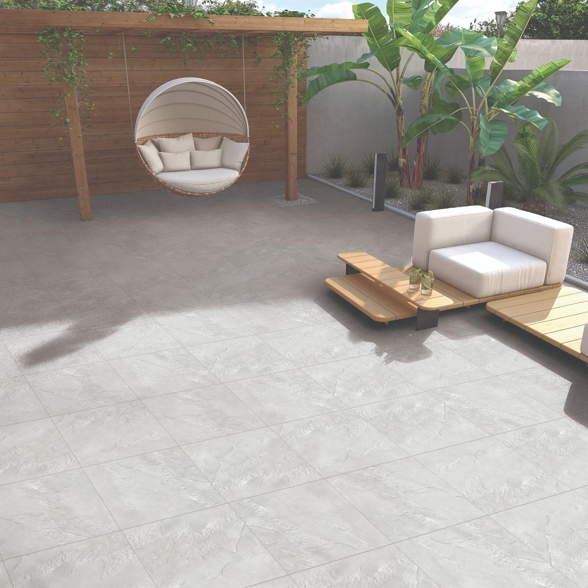
If you have been to anybody’s house or have hosted your friends at your home, you will realise that there’s only so much space to accommodate all your friends and family at once. No matter how big your house may be, when there are people around it will always be less. So, instead of going for chunky and large pieces of furniture, you can play smart and accommodate extra seating in the living room itself. Create a cosy atmosphere or a cosy space by placing a chaise lounge, a swing chair, or a rocking chair. One of the best ways to make optimum use of the corner space is by incorporating a sectional L-shaped sofa. It uses up the cuts and corners resourcefully and you can make room for more and more people!
Introduce Lots Of Light
![]()
It is not an Indian living room if it is not lit enough, pun intended. Introducing lights to your living room can be a clever way to make it look bigger and brighter. To avoid dark corners or shadows within the room, it is essential to add a touch of layered lighting scheme that includes sources of light at different levels so that the light is uniformly spread and also looks more nuanced. This idea works especially in the corners of the living room that are usually ignored. But, it is the corners that bring out the best and the comfiest spaces for people to sink in and enjoy their time.
Install A Lattice Screen
![]()
If you have a gigantic living room area to spare even after spaciously arranging your furniture set, you can install a lattice screen and divide the room into two spaces preferably between the living and the dining spaces. Introducing a lattice screen – an openwork framework consisting of a criss-cross pattern of strips of building material, typically wood or metal – will give a detailed touch to your space and make it look quite interesting. Additionally, it will also offer privacy to those dining plus, you can also move the slats as per your choice and convenience.
Demarcate The Flooring Tiles
![]()
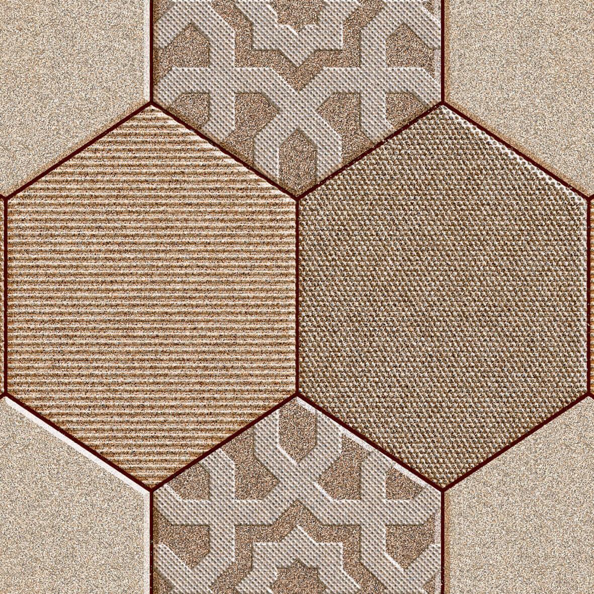
You can synchronise the floor tiles with the colour scheme of your living room and the paints you chose to apply on the walls. In fact, if you are using a lattice screen to demarcate the living and the dining area, you can very well go with two different designs of tiles. One for living and another for the dining area. Orientbell Tiles’s designs are the latest and in line with the latest trends. In the latest Inspire Art collection, you can choose from the Moroccan designs that will give you a very Mediterranean vibe and will also not be too out of place with any of the schemes you choose for the area. Plus, it would really set the mood for the dining space and keep the subtlety of the living space as is.
Use Tall Windows
![]()
Double-height living rooms in themselves give a vibe of a very cosy vacation rental. Although glamorous, airy and very luxurious, it could be a task to utilise it properly with the space and to maintain it. Double-height spaces can also create a brilliant interplay between the public and private areas of the home. Using tall windows will sort that issue for you. Installing tall windows or panels will allow ample natural light in the space thus brightening it up for the entire day, bring in outdoor views and create an illusion of a much larger space! To add more to the illusion, you go for a neutral colour scheme for the living room making it look subtle and statement-making at the same time!
Go For A Focal Point
![]()
Creating a focal point in the living room can be a pleasant change from the usual wallpaper and wall paint cul-de-sac. Now, to create a focal point, you can either go for a wood accent or a tile accent to one of the walls, preferably where all of your guests, family and you congregate more often. Orientbell Tiles’s River series can be a good addition giving you the look and feel of pebbles or a flowing river, something that brings in positivity and durability in one shot!
Natural Colour Pallette For Small Spaces
![]()
For small spaces, the best strategy would be to use lighter hues than darker ones. A neutral colour palette in shades of white, beige or muted grey is recommended. This is because light hues reflect maximum light and make a space seem larger. This illusion can make even the smallest of spaces look actually bigger and more usable with respect to space utilisation. Not a fan of neutral shades? Break in a pop of colour here and there in your rugs, cushions or even artwork.
Go For Metallic Finishes
![]()
Metallic finishes tiles can be really aesthetic and soothing to the modern eye as it gets most of your job done in much less money and time! Go for stainless steel finishes within the mirror frames, or accessories on the walls, pendant lights, and steel tables and so on. The list is endless if you really put your mind to it. These finishes can also be used on the doorknobs, cabinet handles and photo frames to add uniformity.
While the living room design ideas are quick to change and upgrade, some things remain the same. Most times, it’s the beauty of minimalism that gets half your job done. 2021 was the year of staying home and these design ideas will turn your home into a productive abode which you will never complain about and never live without!


