19 Best Two Colour Combination for Bedroom Walls for 2025
15 Mar 2024 | Updated Date: 24 Mar 2025, Read Time : 33 Min
24982
19 Best Two Colour Combination for Bedroom Walls for 2025
Bedroom Wall Colour Combination – Pick the Perfect Colour Combination to Create An Oasis with Beautiful Walls
Nothing is comparable to the feeling of decorating your bedroom – especially when you have just four plain walls staring back at you. You can create an ambience that can help you feel energised at the start of the day and help you unwind at the end of the day. The bedroom is your personal space and should be a reflection of your persona! What makes a bedroom perfect? Is it the furniture, the colours or something else together? While everyone has their own ideas regarding perfection, there are some basic factors that can help you create a perfect space to relax and rejuvenate in – one of them being the right colour pallet. It doesn’t matter if you are moving into a new bedroom or just want to give an old one a facelift – try opting for two colour combinations for bedroom walls instead of one and see the difference it makes! Most people prefer monochromatic pallets since they are safe, but an additional colour can help in adding more visual interest and can help create visual depth.
List Of Two Colour Combination for Bedroom Walls
Yes, it is easier to select a single colour and use it in varying shades in the space. It creates a cohesive look and you do not need to break your head over various combinations. But do not let the ease and simplicity of choosing a single colour keep you from opting for a dual-toned room. Using two colours can not only be fun, but can also give your bedroom a completely new look. Choosing two colours for your space is not the Herculean task you think it is – rather, it is very easy if you know the basics of the colour wheel. Utilise the power of colour to transform your bedroom! It’s as simple to transform your home as it is to comprehend the colour wheel. Find the ideal colour scheme for your bedroom to create a vibrant and engaging ambience. Visit your nearest tile showroom to explore various tile options. Here are the three basic principles to keep in mind:
Complimentary Colours
If you want to create a happy and energising atmosphere in your bedroom, consider using yellow tiles or orange and blue tiles. This will add a visually striking appearance and give your space an eye-catching and unique touch. Also, you can use one colour as the primary colour and the other to balance the design.
Monochromatic Colour Choices
Adding a monochromatic colour theme will give your space a calm and balanced look. Using different shades of the same colour tile can create a relaxing atmosphere. Using tiles is also a great option as it offers a large variety of shades within the same colour family. You can combine them in a design where the light-coloured tiles are bordered by dark-coloured tiles. For example, you can combine DR PGVT Armani Marble Blue DK and DR PGVT Armani Marble Blue LT to add some visual interest while sticking to the monochromatic theme.
Neutral Colours
If you prefer a calm and relaxing atmosphere, neutral colour tiles like white tiles, grey tiles, brown tiles, or beige tiles can help set the perfect mood. Wood-look tiles are another option that complements the neutral colour scheme. Additionally, neutral colour tiles will go well with any colour of the furniture, making it easy for you to change the room design.
Best Two Colour Combinations For Bedrooms
If you have decided that you want to add some more colour to your bedroom walls, read on to know some of the best two colour combinations for bedroom walls that you can opt for!
Blue and grey are the perfect combinations for a modern and uber-chic bedroom. This combination gives off a soothing vibe while exuding an aura of elegance. Blue is a soothing colour, while grey, being neutral, supports the colour and uplifts it. So, you should use a grey and blue two colour combination for bedroom walls to create a comfortable ambience in your bedroom with a sense of modernity.
You can consider blue wall tiles, like DR Matte Breccia Blue Gold Vein, Buy DR Super Gloss Decor Mosaic Blue Stone, and DR Gloss Décor Moroccan Art Blue. For grey walls, you can pick from DR Emboss Gloss Crackle Marble Grey, DR Carving Endless Rondline Ash, and DR Gloss Stone Veins Silver Marble.
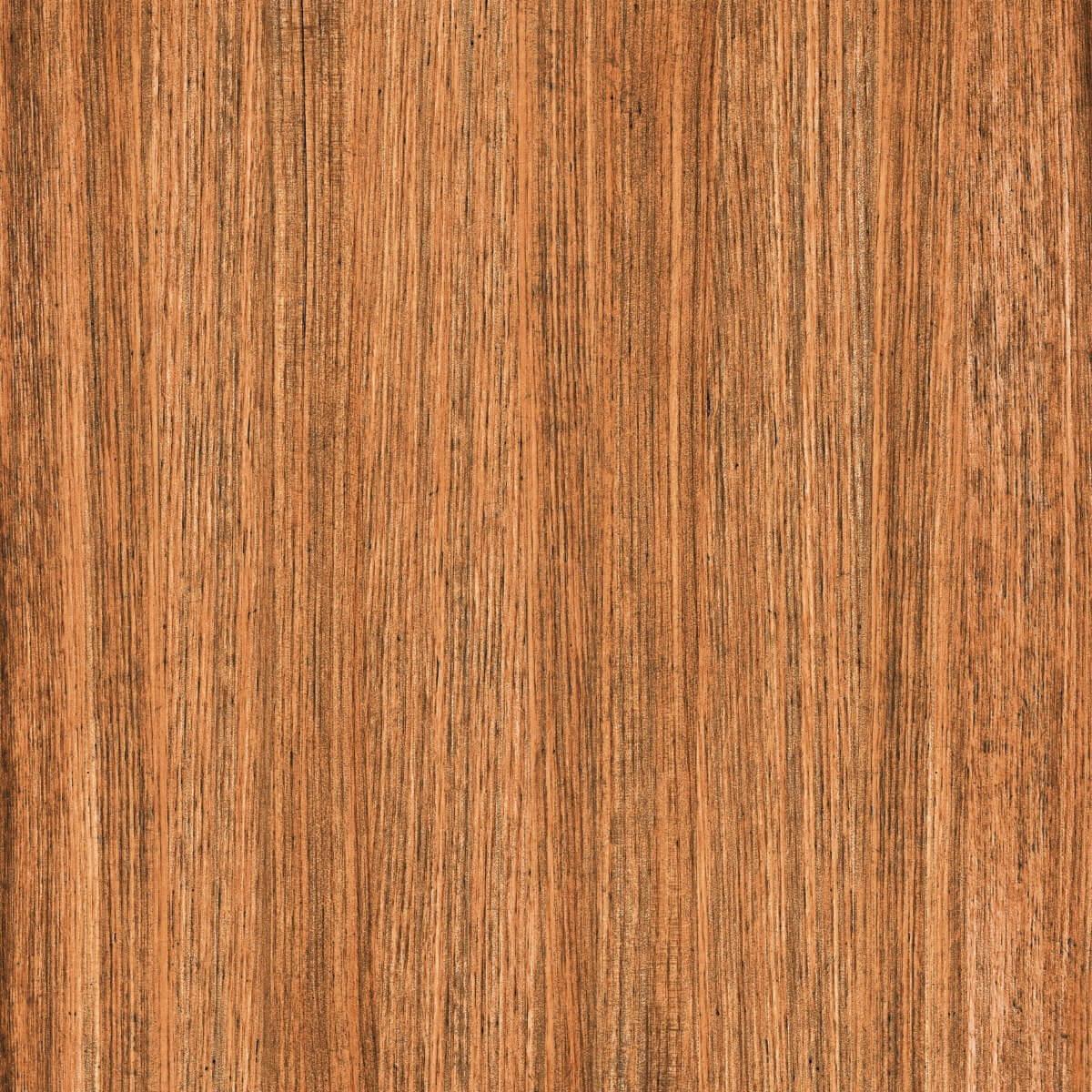
You can consider incorporating DR Matte Statuario Marmi Marble to the floors which goes perfectly with the bold blue-coloured or grey-toned wall. Its subtle marble design in white colour adds a touch of class to your bedroom interior while ensuring safety and comfort. The matte finish of these tiles makes your floor less slippery, hence making them a safer choice for areas with kids and elderly people. Besides, you can consider Crust Sahara Off White for not an all-white flooring. Also, if you want to add a wooden touch to your bedroom interiors, you can consider wooden floor tiles, like DR DGVT Lumber Oak Wood and DR Natural Rotowood Beige.
Light Brown And Green Bedroom Wall Colour Combination
Green is a colour that exudes tranquillity, and when combined with brown, it helps create a relaxing environment. With a nature-inspired feel, this colour combination will evoke a feeling of serenity and calm in you.
For green walls, you can pick tile designs, like DR Gloss Amazonite Aqua Marble, OHG Teal Gold Twinkle HL, and Cloudy Green. You can further combine them with wooden tile choices, like DR DGVT Walnut Wood slats, DR DGVT Lumber Oak Wood, and DR DGVT Plum Veneer Wood Choco. Also, if you lay Super Gloss Onyx Marble Aqua on your walls, consider laying it on the floor as well, for a monochromatic design.
With a green and brown combination, natural wood is the best option you can opt for on the floor. Orientbell Tiles gives you a variety of wooden tile options such as DR Natural Rotowood Beige, which looks just like a natural wood surface in a large size of 600x1200mm. It has a warm, natural feel with a smooth wood texture. Great for flooring, it adds a rustic look to any space.
Yellow and Cream Bedroom Wall Colour Combination
For a cream-coloured wall look, you can opt for Baby Satin Onyx Marble.Its magnificent onyx marble design and soft satin matte finish, add a bit of glitz and depth to your room’s walls. Its large size creates a cohesive look throughout with minimal grout lines. Also, you can consider cream granite tiles, like Nu Seawave Rich Gold and Nu Canto Creama, or cream brick tiles, like SPB Brick Creama. You can easily pair them with yellow tiles, like DGVT Yellow and Plain Mango Yellow. For floors, you can pick a subtle, plain design that complements and balances the warmth of the yellow. You can also add Veneer Wood Beige tile on the floor. With a matte finish, these tiles are designed to mimic the appearance of beige timber in size 600 x 1200 mm, making them an ideal combination with beige marble and yellow walls. Besides this floor tile design, you can go for grey tiles, like DR Gloss Stone Veins Silver Marble, brown tiles, like DR Gloss Endless Royal Dyna Brown and HRP Brown Diagonals Wood, or white tiles, like PGVT Carrara Natura.
Dark Grey and Light Grey Two Colour Combination For Bedroom Walls
Transform your area with a beautiful monochromatic design using Sugar Coquina Sand Grey DK. You can pair its soft colours on the wall with the recommended dark grey tile. Made from glazed vitrified material, these tiles are available in sizes 600 x 1200 mm. It comes in a sugary texture design that adds a unique feel to the walls of your bedroom area. Do you know that when light hits them, they glow? Yes, its tiny sugar-like texture shines and can be felt when you run your hand on the wall. This bed room colour combination will create a modern and stylish atmosphere in your bedroom, making it more cosy and subtle.
Linea Statuario Gold Vein is a classic white tile with a matte finish that you can consider pairing with the orange colour on the wall. Its neutral base and textured surface allow the orange colour to stand out. Other than this, you can consider some other white tile choices, like PGVT Azario Gold Calacatta Marble, Silken Statuario Bianco Marble, and Granalt Statuario, to complement the orange walls. Whereas, FT Burma Teak Wenge on the floor balances the entire room exuding warmth around. This Bedroom colour combination works with both traditional settings and modern decor, creating a sophisticated and contrasting backdrop for brighter colours. Besides this floor tile, you can infuse Carving Metal Breccia Marble, DR Matte Coquina Sand Creama, DGVT Peru Wood L, or HP Plain Terracotta, perfect for highlighting the two-toned bedroom walls.
Teal and Mink Bedroom Wall Colour Combination
For teal walls, you can use SBG Strips Teal Green to compliment the mink tones. With the teal and mink bedroom theme, wooden tiles bring a subtle glamour. Opt for DGVT Chestnut Oak Wood if you love the look of real wood but want something easier to manage. Its natural colour creates a balanced ambience in the bedroom. It is made of vitrified material and comes in a size of 195×1200 mm. With a natural look and matte finish, this design is perfect for the floor of your bedroom area. Besides this wooden plank tile, you can consider a few more tile options for your teal-and-mink themed bedroom, you can pick Nu Canto Grey, DR Matte Coquina Sand Creama, Sahara Rock P Kota Green, and DR Gloss Endless Softmarbo Beige.
Light Blue and Yellow Bedroom Wall Colour Combination
To bring the entire space together, you can consider DR Matte Classic Travertine Golden for floors. This floor tile has a matte finish with a rustic golden touch that creates a modern touch in your bedroom. This combination can make your area appear coordinated and stylish with both surfaces complementing each other. Besides this travertine tile, you can consider floor tiles, like Nu Canto Grey, Nu River Golden, DR Carving Colour Calacutta Marble, and Sahara Rock P Kota Green, to create a vibrant yet harmonious atmosphere in your bedroom.
Dark Blue and White Bedroom Wall Colour Combination
For this look, you can pair the dark blue walls with the evergreen DR Matte Plain White. Its plain, pearl white tone and matte finish complement the darker blue hue. The matte finish in marble design gives an understated vibe to the area, welcoming the luxury in your bedroom decor. For dark blue walls, you can go for wall tiles, like Super Gloss Blue Marble Stone DK or BDM Cemento Blue with this white tile. If you prefer a luxurious tile design with a blend of white and blue tones, you can opt for DR PGVT Elegant Marble Gold Vein to create a stunning accent wall.
Whereas for floors, if you want to add a touch of grey, incorporate a soft, light grey-coloured tile. DR DGVT Sand Grey LT. Its ultra-modern vibe transforms your area into a modern charm. The tile’s subtle texture mimics natural sand, adding a touch of elegance to your floors. Its light grey shade easily matches various decor styles and with this dark blue colour of the wall. Also, you can think about some other floor tile options, like DR Matte Antique Riano Blue LT, DR Gloss Stone Veins Silver Marble, or Marstone Creama, whichever suits your style.
Pink and Green Bedroom Wall Colour Combination
For pink walls, you can opt for tiles like OHG Calendula Pink HL, HBG Flora Grid Pink LT, SBG Cement Pink DK, and SBG Cement Pink LT. You can pair them with green tiles, like OHG Line Floral Grid Aqua HL and ODG Floral Grid Aqua DK.
With a pink-coloured wall, wood-like tiles are the perfect match. So create a cosy bedroom area with GFT BDF Herringbone Blond Oak. Its herringbone design and matte finish give a unique and catchy decor to your bedroom floors while also keeping the look understated. Additionally, you can explore more floor tile options, like Silken Desert Marble Beige, Crust Sahara Off White, and Crust Sahara Green, for more creative bedroom decors.
Also, GFT BDF Strip Wood Beige is a beautiful design in ceramic body by Orientbell Tiles which you can consider adding to the floors. With the dark charcoal wall, the striped wooden design of this tile looks beautiful. This combination can help to create a calm and relaxing atmosphere. Moreover, you can opt for HRP Grey Diagonals Wood, Rustica Foggy Smoke, DR Carving Colour Antique Vein Riano, and DR Gloss Endless Canova Statuario — choose whichever option fits your style and the mood you want to create in the bedroom!
Gray and Mellow Yellow Bedroom Wall Colour Combination
DR Carving Endless Rondline Grey DK is the perfect pick from the Orientbell Tiles. In a size of 600 x 1200 mm, these glazed vitrified tiles feature a smooth marble design to give a sense of refinement and coherence to your bedroom area. They look and feel like real marble, with a natural texture and beautiful veining. Also, its glazed finish makes it easy to wipe clean. Besides this grey tile, you can consider DR Emboss Gloss Crackle Marble Grey, DR Carving Endless Rondline Ash, and DR Carving Endless Dalya Silver Marble, or decorative options, like Linea Decor Leaf Multi and Carving Endless Florence Marble. Along with these tiles, you should consider yellow tiles, like Plain Mango Yellow and DGVT Yellow.
For the grey floors, consider Morfish Gris Grey in a size of 145x600mm. These tiles boast a soft almost smoky design look that immediately balances the entire vibe of your bedroom. The charm of yellow and the subtle warmth of grey, give a unique decor and create a modern design in the bedroom. Besides grey floor tiles, you can consider other flooring colours, like DR Gloss Endless Canova Statuario, Veneer Wood Beige, and PGVT Ceppo Stone Grey LT, to beautifully complement the walls.
Peach and White Bedroom Wall Colour Combination
Peach is an often preferred colour for bedrooms, thanks to the comforting effect it has on the mind. Combine the soft hue with some milky white walls to create a minimalistic décor scheme. Bright white accessories can complete the look and elevate the aesthetic of your bedroom.
Linea Statuario Gold Vein offers an outstanding design in white colour having linear texture in a matte finish. These features raise high-depth punch lines that you can feel when you touch them. You will love the overall look it is going to create while blending with a soft peach shade. With its intricate gold veins set against a Statuario marble backdrop, the tile exudes elegance and style in the bedroom. Also, you can consider some other white tile designs, such as DR Matte Endless Canova Statuario, DR Carving Endless Gold Spider Marble, and HRP White Hexagon, which can complement the peach walls.
For floors, pick a wooden tile such as Veneer Wood Brown. It offers your bedroom floors a rich, earthy aesthetic and natural vibe. Made from glazed vitrified material, these tiles feature a matte finish that complements the peach colour. Other floor tile options you can consider are SPB Silvia Marble Beige DK, Nu Seawave Rich Gold, DR Gloss Stone Veins Silver Marble, and Carving Colour Endless Carara Line.
Black Pitch and Grey Bedroom Wall Colour Combination
Olive Green and Rusty Pink Two Colour Combination For Bedroom Walls
For instance, you can pair the gorgeous deep green colour with HWG Stripes Pink DK. It features a soft pink shade that is perfect for creating modern and refreshing decor in the bedroom. Its ceramic body and small size allow you to experiment with various design options. Plus the horizontal sleek lines give a textured effect to your bedroom walls and make it look refreshing. Other than that, you can explore some other pink tiles, like SBG Cement Pink DK, ODG Sarta Pink DK, and ODG Sarta Pink LT. For green tiles, you can choose from Streak Sahara Green, Sahara Green, DR Gloss Amazonite Aqua Marble, and OHG Teal Gold Twinkle HL to combine with pink tiles.
Pale Blue and White Bedroom Wall Colour Combination
For the side walls, you can opt for a plain white wall tile like DR Matte Plain White. For a more luxurious and dramatic touch, consider these glossy finish tiles such as PGVT Endless Calacatta Marble with a striking marble pattern. Both matte finish and glossy finish tiles add a luxurious look to your area. They are easy to clean and maintain, plus look best in pale blue shade. To blend blue tones with the white tiles, you can choose from these blue tiles, like DR Matte Breccia Blue Gold Vein, Super Gloss Blue Marble Stone LT, and BDF 5×5 Moroccan Blue FT. Also, choose something in contrast for the floors, like a wood-look tile. DR DGVT Plum Veneer Wood Choco comes in a dark choco colour featuring a soft design to mimic the wood look. These tiles offer a warm and inviting feel to the bedroom. The contrast between the plain white walls and the dark chocolate floor tiles creates an interesting and balanced look in your bedroom area. Also, you can consider DGVT Coquina Sand Grey LT, DR Carving Endless Statuario Gold Vein, and Marstone Creama for your bedroom flooring.
Lavender and Off White Two Colour Combination For Bedroom Walls
The lavender colour on the wall and DR Gloss Endless Carara Line are sure a hit formula. The glossy tile featuring golden veins adds a unique look to your walls. Its glossy shine is easy to maintain and reflects light falling on it to make the area appear larger and brighter. Also, you can go for other white tile choices, like Streak Sahara Off White and Sahara Off White, to complement decorative lavender tile choices, like SHG 3D Flower Purple HL.
Similarly, on the floor, go for Carving Colour Endless Carara Line, a masterpiece in itself with continuous vein patterns that offer an uninterrupted design flow to your bedroom. Their 600×1200 mm size minimises the grout line and ensures they cover large areas. The Carrara marble design with delicate veining creates a sophisticated look when you pair them with a contemporary lavender colour and DR Gloss Endless Carara Line. For some other flooring choices, you can consider DR Carving Endless Rondline Ash, DGVT Coquina Sand Ivory, and Natural Rotowood Creama for lavender-and-off-white bedrooms.
For floors, you can consider DR Matte Coquina Sand Creama featuring a soft beige colour that pairs perfectly with the brown shade of walls. Its matte texture not only provides a good grip over the surface but also exudes a calm and understated look within. Also, you can select from HP Plain Terracotta, Smooth Anti Skid Cloudy Ash, and Sahara Off White to add depth and interest to the bedroom design.
Burgundy and Beige Bedroom Wall Colour Combination
You can pair these bold-coloured walls with Carving Metal Breccia Marble featuring a stunning Breccia marble design in rich brown and beige tones. This creates an ultra-modern look in your bedroom. The intricately carved design in beige colour and dark Burgundy shade, when come together make your area shine like never before. Besides, you can opt for some more beige tiles, like SPB Silvia Marble Beige DK, Carving Decor Geometric Line Art, and PGVT Creama Marfil Dark, to blend well with burgundy walls. For flooring, you can select floor tiles, like DGVT Desert Wood Creama, DR DGVT Plum Veneer Wood Choco, and DR Carving Endless Dalya Silver Marble to enhance the overall bedroom design and bring more depth to the room!
Colour has a great impact on the overall look of the space, and choosing the right colours can help you set the perfect mood for the space. Here are some colours that will help make a smaller room feel bigger and more open:
Dark Blue
Small rooms often require a wow factor to distract you from the tightness of the space, and a dark blue wall does just that. One dark wall, paired with three lighter walls, can have a bold impact on the look of the space.
Warm, Earthy Ochre
Small rooms often require a wow factor to distract you from the tightness of the space, and a dark blue wall does just that. One dark wall, paired with three lighter walls, can have a bold impact on the look of the space.
Off White
Off-white is a simple and clean colour that makes it extremely easy to work with. The soft colour makes the space seem much bigger, especially when used in contrast with vibrant colours and some well-placed plants.
Dark Grey
Dark grey has this modern, minimalistic feeling that most people love. It has a very clean and crisp look, making the room feel elegant and sophisticated. It also provides you with crisp edges that make the space feel tidier and bigger than it actually is.
Pale Blue
Pale blue is a soft colour that has the ability to invoke the feeling of openness and lightness, making the space feel open and lighter. The colour can be paired with other lighter colours, such as white and baby pink, to create a calming and relaxing space.
Sea Green
Sea green is a very gentle colour that evokes a minimalistic vibe. It pairs well with woodsy colours and can have a very soothing vibe in the space. It can freshen up the room and make it feel brighter, making a compact space seem bigger.
Light Green
Light green is a vibrant colour that pairs very well with neutral colours like white to create an open space. It can give a modern look to any space and can make the space feel calm and inviting.
Charcoal Black
If your room doesn’t have a source of natural light, black can help make a room feel more intimate. It can be used as a complementary colour to a lighter colour, such as light purple, light blue or light green and can make the room feel bigger and grander.
Taupe
Taupe is a dark brownish-grey colour that has a relaxing effect on the mood of a space. Since it is on the lighter end of the colour scheme, it can make the room feel a lot bigger than it actual.
Understanding the Pros of the Right Bedroom Colour Combination
The fusion of the wall tones that you go with for your bedroom can affect the overall impression and feel of the space. Here are a few pros of picking the right bedroom colour combination.
1. Mood and Relaxation
Tones have the ability to control your feelings and temperaments. If you go for a pale and pleasant wall colour combination, you can create a serene and relaxing feel, which can promote a peaceful night’s sleep. You can get rid of insomnia with wall tones like soft blues, peach, and pale pink in your bedroom.
2. Affect on Lighting
Shades can interact with the light sources in the bedrooms, influencing the visual impact and the ambience in the room. Whether you have large windows to allow the entry of natural light or have to rely on artificial lighting in your bedroom, remember that lighting in your room can alter the perception of the wall colour combination. That’s why you should pay close attention to the lighting conditions of your room to let the wall colour combination set the mood and feel you desire. For that, you can consider testing different colour samples in your bedroom under different lighting situations to make sure you get the desired feel and appeal in the room.
3. Psychological Impact
Tones can also psychologically impact your mind and feelings. For example, if you pick more vibrant hues for your bedroom walls, you can sense a drift towards positivity in the room. Similarly, if you pick cooler shades, for your bedroom walls, you can witness an inclination towards setting a feel of serenity in the space. So, while selecting the colour scheme or the colour combo for your bedroom walls, you should consider the psychological impact of colours and choose them according to the ambience you would prefer in your bedroom.
4. Expression of Personality
As your bedroom is your personal haven, your bedroom’s colours should communicate your personality and reflect your character. So, the right bedroom colour combination depends on your taste and personality. Whether you prefer bolder and more vibrant hues or muted and more subtle tones, you can choose whichever colours you like to create a unique bedroom look that you can own.
5. Visual Appearance
With the right colour choices for your bedroom walls, you can elevate the visual appeal of the space. Whether you pick complementing colours or contrasting ones, you can infuse visual depth, impact, and balance in the space. While picking the best colour for bedroom walls, you must consider the size and layout of the room to maximise the effect of the wall colours, like making your compact bedroom appear larger or creating an intimate feel in a large bedroom.
6. Balance and Cohesion
The right colour combination for your bedroom walls can add a visual balance and a sense of collaboration in your bedroom. While deciding on the best colour for bedroom walls, you should ensure that the shades go well with your furnishing and other decor elements to maintain a cohesive look throughout the room. After all, the combinations of well-balanced tones can create a sense of unity and balance, evoking the visually pleasing factor of the space.
Guidelines to Choose a Bedroom Colour Combination
While determining the best colour for bedroom walls, there are a few things that you cannot miss considering. They are the size of the room, the overall room decor theme, and the amount of natural lighting entering the room and its direction. Besides them, consider the following factors.
Mood and Feel: The most appropriate combination of two tones can provide elegance and visual appeal to the bedroom. While picking your bedroom colour design, you should prioritise infusing the feeling of comfort in your room. Only the right tones can turn any ordinary bedroom into a soothing getaway within your house. Moreover, the right bedroom colour combination of two tones can provide a cosy and calming ambience where you can relax and enjoy a peaceful sleep every night.
Accent Walls: Another excellent idea to upgrade your bedroom colour design is creating a feature wall that draws attention to the walls. Ideally, any accent wall should not have any doors or windows but have a large wall space that can be decorated with different eye-catching wall tiles to serve as a focal point in the room. Any decorative wall tile or mosaic mural design will be perfect for creating a trendy and elegant accent wall that enhances the visual appeal of your bedroom.
Textures: Not just solid-coloured wall tiles, you can also consider combining colours with textures while determining the perfect colour combinations for your bedroom walls. You can combine stone or marble-effect wall tiles with natural textures with a neutral beige wall colour. Or, you can pair metal tiles with maroon or blue walls.
Patterns: You can consider infusing wall tiles with large patterns to make a statement in your bedroom. You can go for geometric tiles or wall tiles with herringbone or chevron patterns to create a feature wall with a dramatic effect in the room.
Visual Expansion: To make your room appear larger than it really is, you should prefer going for neutral or light-toned wall tiles with polished surfaces. The subtle tones and polished surfaces of these wall tiles will reflect light and illuminate the entire bedroom, making it appear brighter and more visually expanded. Also, the light tones on the upper half of the walls will help in visually elongating the height of the ceiling, making your low-ceilinged bedroom look taller.
All in all, you do not have to use the best colour for bedroom walls in a ratio of 1:1. Use the tones to visually separate one zone from another within the room. For example, you can separate your reading corner from the sleeping zone with a different wall colour choice.
Bedroom Colour Combination: Impact of Combining Different Tones
The room colour combination affects your sleeping patterns, mood, and even habits. That’s why you must find the right colour combination for your bedroom walls that aligns with the ambience you desire in the room. Here is a list of different shades and how they can impact your room’s appeal and feel.
White Hues for Bedrooms
White hues represent purity and simplicity. These hues can evoke a feeling of peacefulness and calmness in the room, promoting relaxation and sound sleep. Also, they can make small bedrooms appear expanded, brighter, and more airy. So, if you are looking for a not-any-over-the-top or normal bedroom colour, you should pick white hues for your bedroom walls.
Yellow Shades for Bedrooms
If you want to infuse happiness and a feeling of joy in your bedroom, yellow shades are best for you. If you want to paint bedroom in two colours, go for a combination with yellow wall tiles (rather than painting if you want durability). They are considered the colours of cheerfulness and vitality, so they are perfect for people looking for a dose of positivity every morning before they start their day.
Blue Shades for Bedrooms
Even though shades of blue are preferred in damp areas for a cooling effect, you can add them to your bedroom for the same cooling effect. These shades can provide a relaxing feel, particularly if you pick a lighter tone. After all, they represent serenity, spirituality, and calmness, which is a perfect combination for any bedroom.
Orange Hues for Bedrooms
If you want to paint bedroom in two colours, particularly in bright colours, you should consider laying for orange wall tiles rather than painting. These orange hues promote liveliness and good well-being while adding a sense of playfulness to the space. They can also provide a relaxing feel, helping you to sleep soundly.
Black Shades for Bedrooms
Even though black wall tiles come in varying degrees of blackness, they can add a sense of mystery, elegance, and power to your bedroom decor. If you are looking for a room colour combination that keeps negativity at bay and protects you, black is the right colour for your bedroom.
Pink Hues for Bedrooms
For a feeling of comfort and serenity in your bedroom, you should consider picking wall tiles in pink hues. The darker hues of pink represent affection and passion while the lighter shades denote devotion and warmth. You can pick the shade of pink that creates your desired feel in the room.
Green Tones for Bedrooms
If you are looking for a very normal bedroom colour that does not overpower other decor elements in the room, you should consider the tones of green. According to Feng Shui, these tones denote freshness, growth, and a new beginning. Also, they have a calming effect on the eyes and brain because of their natural feel.
Choosing Paint Colours to Match Your Floor Tiles Based on Textures and Tones
Choosing a colour pallet that works well with existing tile flooring can be a little tricky. The walls and floors of your room need to complement each other or else the whole room will seem a little off-balanced. Here are some pointers you can keep in mind while choosing the paint colours for your room based on the tile flooring:
Find The Undertones That Work Well With Your Floor Tiles
Discovering and establishing the undertones of your existing flooring is one the main factors while determining the colours of your walls. Tiles with cooler undertones work best with cool colours like green or blue and might not work well with warmer colours like yellow. On the other hand, flooring that has warmer undertones works best with hues of yellow and soft neutrals. It is best to avoid shades that have a strong tan presence as they can pull down the mood of the whole space.
Keep In Mind The Texture Of The Tile
A lot of times, we tend to ignore the texture of the floor tiles while determining the wall colour. Natural stone look tiles pair best well with neutral colours, regardless of the colour of the tiles. Similarly, smooth and glossy tiles look best when paired with darker and dramatic shades.
Wall Colours to Complement Your Tile Colours
As mentioned before, choosing the right colours for your floors and walls can be a tricky process and if certain factors aren’t kept in mind, you will end up with a space that is a hot mess. Two more factors to consider while choosing the tiles for your bedroom are the size of the room and the colours of the walls, as both will have a great impact on the overall look of the space. Here are some fail space and bedroom and floor tile colour combinations:
Purple Walls With A Yellow Undertone Floor
As mentioned before, yellow and purple are complimentary colours on the colour wheel and the combination of these two colours works well in creating a space that is vibrant and happy. Here are other purple two colour combination for bedroom walls.
Go Rustic With Red Undertone Floors And Green Walls
While red and green often scream Christmas, the combination can be used in ways that work well year-round too. Floors with red undertones and dark and mossy green walls can have a rustic yet beautiful effect.
To give your room a spacious look, you can use the following tiles with almost any wall colour:
Choose the following tile colours:
White tiles
White is a neutral colour that works well with almost any colour – just make sure you match the undertones of the white with the shade of your choice. For example, off-white floor tiles pair beautifully with lavender walls, while bright white floor tiles look striking against navy blue walls.
Grey Tiles
Grey is another neutral colour that pairs well with almost any colour. Grey and blue, grey and pink and grey and yellow are some of the classic combinations you can use in the bedroom.
Soft Black Tiles
While people don’t really prefer using black in bedrooms, it really is a colour that can add a touch of elegance and sophistication to your room. Since the floor will be darker, it is best to opt for lighter wall colours, such as white, beige or brown, to brighten the space.
Light Neutral Tiles
Neutral tiles, especially the lighter ones, work well with most colour pallets, subject to matching the undertones. Beige can be paired with pink, grey with a pale yellow, white with dark blue, and brown with a refreshing green – the possibilities are endless.
Pastel Tiles
Pastel shades are known for being soft and pale colours, but pastel tiles have a great impact on the overall look of the space. Pastel floor tiles can be combined with a number of bright as well as neutral walls. For example, a baby blue floor tile may be used in conjunction with soft pink walls or a mint green floor tile may be paired with brown tiles for a serene look.
While you can use most colours in the bedroom, a study has shown that blue is the best colour to use in the bedroom for a good night’s sleep, followed closely by a tranquil green. Colours like pink, white, and beige can also help you feel relaxed and rejuvenated. On the other hand, large doses of red, purple, orange, brown and black, since they evoke energy and can make it difficult to relax. That said, you can still use the aforementioned colours in the bedroom in small doses and in muted shades – just don’t opt for bright tomato red walls, it will make sleeping difficult for you!
The best colour to improve sleep is the colour blue. It is the colour of the sky and the sea. It can also be linked to evoking a feeling of trust, dependability and stability. The colour also brings in a sense of safety, relaxation and calm in us – making it the best colour to improve the quality of sleep.
While you can have two accent walls, having more than one accent wall beats the purpose of having an accent wall. An accent wall is supposed to work as a “wow factor” in the space, and having more than one accent wall will diminish the effect it has on the space.
Blue is one of the most relaxing colours for a bedroom. It induces a sense of calmness and adds to the sense of safety you feel – a major plus in the bedroom where you are at your most vulnerable self. The colour is also linked to evoking feelings of stability, dependability and trust, making you feel relaxed and calm.
Mannika Mitra brings a wealth of experience to her role as Digital Content and Marketing Manager at Orientbell Tiles, having been associated with the company for the past 5 years. With a total of 12 years in the industry, Mannika holds an Arts degree from Delhi University and a Post-Graduate Diploma in Journalism and Mass Communication. Her journey has seen her excel as a digital producer at esteemed news agencies like ANI, NDTV, and Hindustan Times.


 600×1200 mm